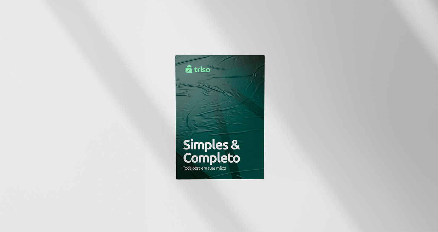

Trindade Soluções Construtivas approached us once again — this time, to develop the naming and brand identity for a startup app focused on construction site management.
The brand concept was carefully built around key terms provided by the client: Trindade, construction, vision, management, projects, simplicity, and solution. The influence of Trindade, the parent company, played a central role in shaping both the name and the pictogram.
The name Triso merges “Tri” (a direct nod to Trindade) with “so”, which was redefined as “solution” — encapsulating the app’s core purpose: a smart, accessible, and effective solution for managing construction workflows.
The pictogram symbolizes a house formed by three Pythagorean triangles, known for their precise proportions and structural harmony. This geometric arrangement reinforces ideas of solidity, organization, and constructive intelligence — all aligned with the startup’s value proposition.
To visually express the simplicity and usability of the app, we developed a symbol with soft lines and minimal forms. The lowercase typeface further emphasizes a friendly, accessible tone — fitting for a startup that puts user experience first.
Finally, the color palette blends fresh and modern tones, maintaining a subtle visual link to the parent brand while asserting the startup’s own identity as a modern and innovative digital product in the construction sector.
PARTNER
Gabriel Galerum
CONTRACTOR
Galerum Design Studio
PROJECT TEAM
Gabriel Galerum
SECTOR
DISCIPLINE
Construction
Logo, Visual ID, Naming
2024
Triso App
Trindade Soluções Construtivas


